Calibrate Kelvins with Intent
Select warmer baselines for living spaces—often near 2700K—and allow warmer-dim sources to drift toward candlelit ambers at night. Mix 2700K and 3000K with restraint to separate zones without clashing. Cooler white may suit a workspace, yet evening rituals benefit from amber softness that signals calm, preparing eyes and minds for rest.
Honor Skin and Materials with CRI 90+
High color rendering, ideally CRI 90 or above with robust R9 values, ensures complex woods, leathers, food, and skin look lush rather than dulled or gray. LEDs have matured; choose premium chips and trusted brands. When comparing, lay samples under the candidate light and judge with your eyes—truth appears immediately in subtle undertones.
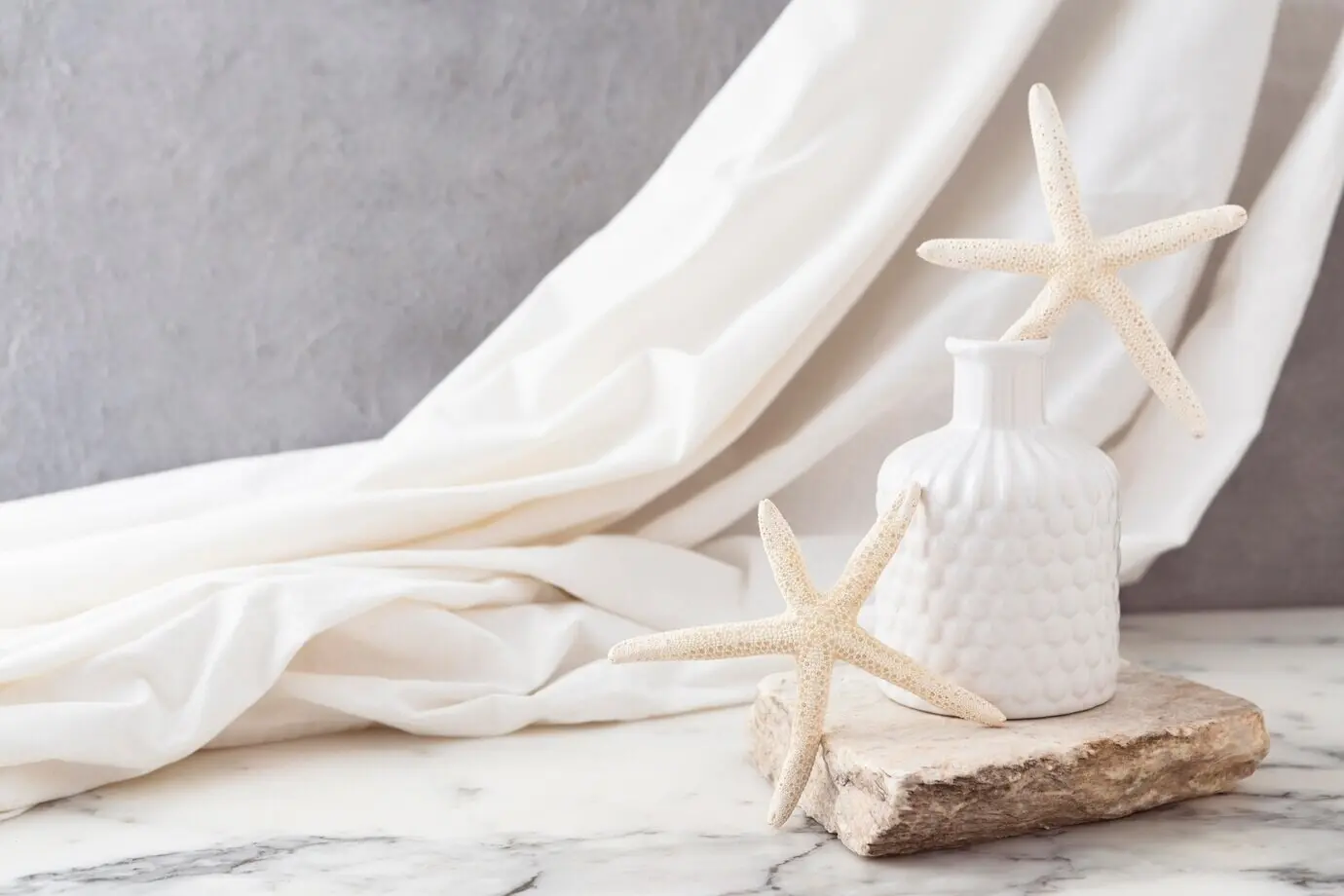
Blend Warmth Across Textures
Use warmer pools over tactile textiles—bouclé, velvet, and washed linens—while allowing slightly brighter, still warm light to graze stone or plaster. Brass comes alive with honeyed tones; chrome needs softer output to avoid glare. Remember, reflective objects multiply intensity, so temper brightness and lean on diffusion to keep reflections elegant, never brash.